Seasonal campaigns
Always staying true to the larger Five Below brand. These seasonal campaigns needed to be distinct to highlight newness and intrigue the customer. They were always rooted in the customer mindset and current trends.
Largely collaborative projects that included cross department involvement.

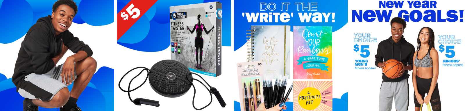
A dream-like feeling for fitness and mindfulness
This concept was meant to have a dream like feeling to represent the aspirational mentality of fitness and mindfulness. The customer responded well to this and the multiple colors guided the customer in a subconscious way as we sectioned off the products according to color scheme.


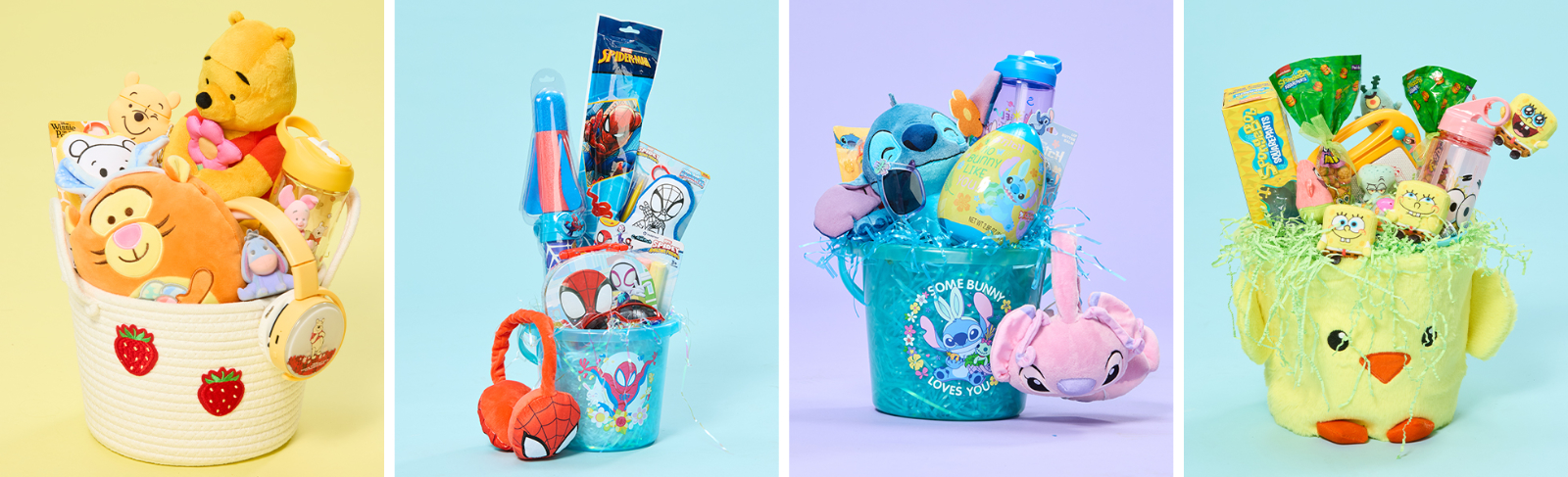
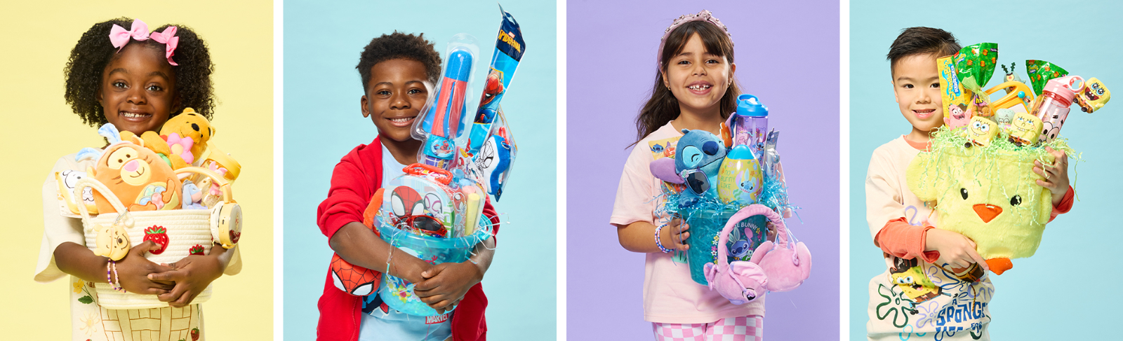
Easter is all about pastels
As one of the youngest skewing seasons, we talked about what it was to be a child on Easter. Crafting became the central conversation. The subtle paper background was a nod to the fun crafts children make with their parents, while grounding the colors in light pastels.

From a short window to a fan favorite
In earlier years Five Below would only have a short window into Valentine's Day as it seems to be engulfed in surrounding seasons. This year, based on past customer behaviors, we decided it was best to push it to the forefront. It paid off in a big way. The customer loved the heart centric designs making this campaign a fan favorite.



Pushing into an older audience
While Easter may be the youngest season, Halloween has the opportunity to push into our older audience. This was highlighted with dark colors, neon glow, and of course the scary decorations. Licenses play a really big part of this collection as they are highly collectible and will quickly sell out. Halloween has the massive opportunity to highlight Five Below's extreme value for all kinds of decorations and costumes.



Let's make something good.
Open to senior digital and graphic design roles and projects. Email is the fastest way to reach me.