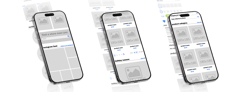
The company was changing from Magento 1 to Magento 2 giving us the opportunity to recreate the entire online customer experience.
Web + mobile UI
Design System Guidelines
Homepage Flow Guidance
ADA Compliance
Lead Product Designer
Figma
Photoshop
Html + CSS
JIRA
Whiteboards + Coffee
3 Senior Leaders
1 Graphic Designer
1 Copy Writer
2 Developers
6 Months
Five Below was still using Magento 1 which was being sunset by Adobe. For security reasons we needed to quickly move the site to Magento 2.
Redefine the structure of the entire site during this transition period. Starting with the homepage define the positioning of all the basic elements for a purposeful flow.. This would allow for fast and consistent structure on future design updates. Allowing for style changes later on that would be easy to orchestrate.
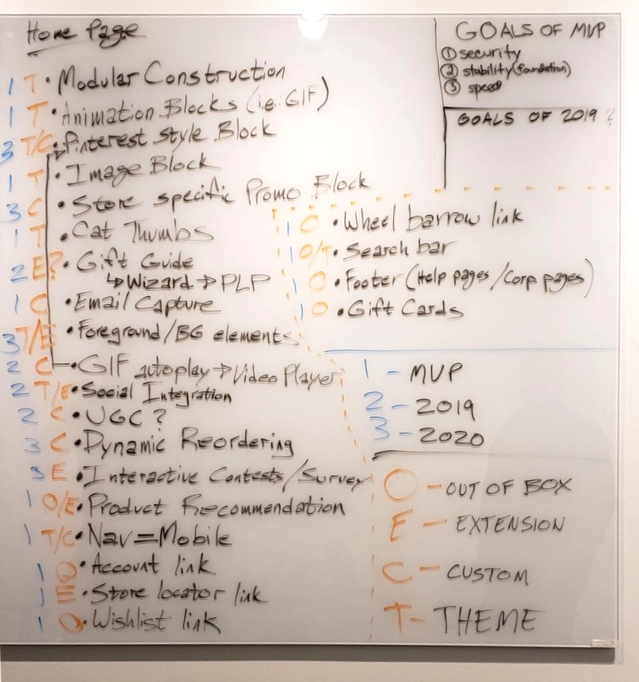
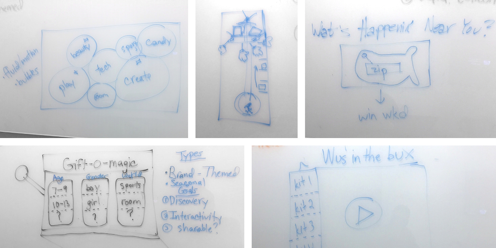
We determined what elements we currently have on site and what could be added on. We did not hold back on ideas and let them all come out onto the whiteboard. These would later be prioritized based on the need vs difficulty to build within our timeline.
We interviewed people from various backgrounds to understand their needs for a website. Ranging from using the mobile experience to pre-shop before going to a store, to desktop only users buying for their kids. Every experience and situation needed careful consideration.
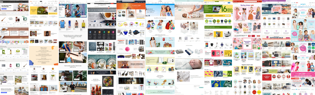
Reviewing many sites across all genres allows for a deeper understanding of what online flows look like. This gives a birds eye view of what age groups and demographics are looking for in each category.
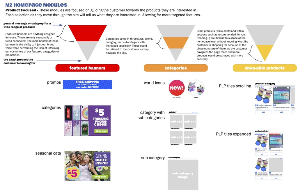
We further broke down what each section of the competitors were doing on their sites and how it would relate to Five Below. This really came together with a visualization of the job accomplished by each section with a color coded chart. Senior Leadership was easily able to digest this information quickly allowing them to supply proper feedback.
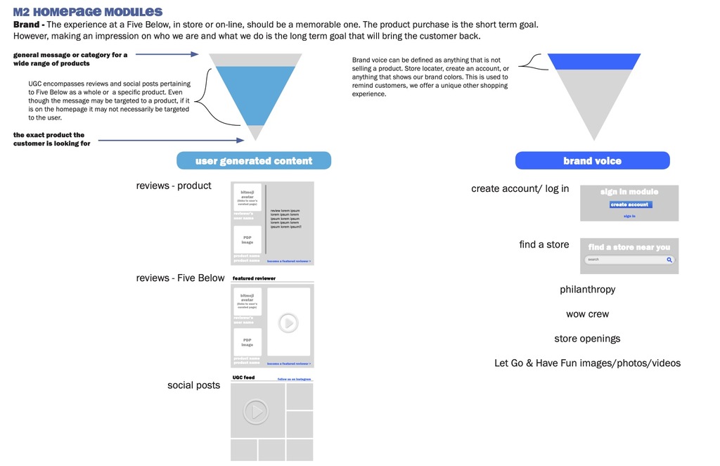
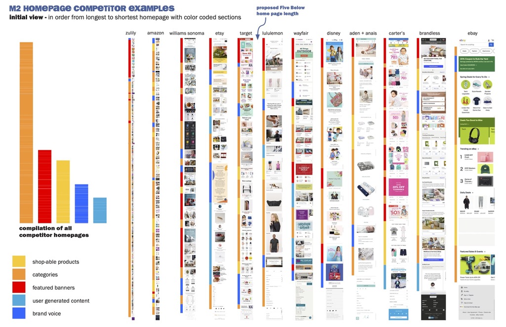
Teens and Tween is the focus for Five Below as a company tent pole. The website is a different audience as the customer is typically an older adult buying for their child or grandchild.
We gathered all data onto sticky notes and began working to find patterns and connections in all of our research. What came out of this was a brainstorming session that was a joy to walk into everyday.
Components pulled from the Competitor analysis matched up with the learning from our interviews determined what modules would be best in position on the site. Pairing them with the screengrabs along with a wireframe mockup showing them in position helped the senior leadership visualize the homepage coming together.
Designing the image assets within the design allowed for everyone to get their hands on a working model of the homepage. With all the branding and color involved you can really see the details of the work come together. The customer may only see fun graphics and elements without realizing the carefully constructed framework the page is built upon. Moving the customer along on a journey that is impactful and feels as natural as walking down the aisle of the store itself.
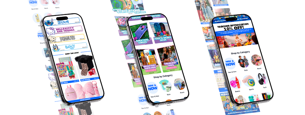
Our design process, driven by extensive research and user feedback, led to the creation of an intuitive and user-friendly homepage for all customers. Both returning and first time shoppers will enjoy the experience of being on the Five Below site.
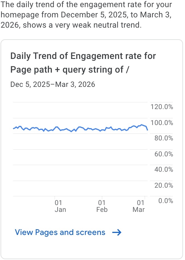
Key features such as the timing of product placement on site along with ‘find a store’ options allow all users to feel completely in control of the experience. Giving the user options to control how they interact with a site brings longer retention along with increased engagement rate.
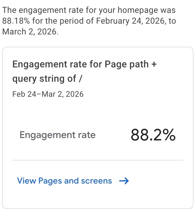
All of this work delivered an increased engagement rate hitting over 88%.
contact@davidbuceta.com